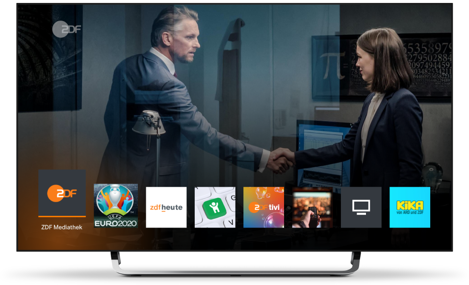
ZDF - HbbTV start bar
Point of Origin
Trends
The HbbTV Catch-Up TV Services are increasing by their content and their feature scope day by day. Constant growth of VOD and linear TV integration.
The linear channels are a funnel for VOD users of the different broadcaster apps.
Problems
The start application of the broadcasters HbbTV apps offer various features like restart, access to different content apps and specific content recommendations. The viewers of ZDF have mentioned in regular survey, that they’re struggling to process the various information of the start menu in that very short time. They mentioned as well, that they only use the start menu to get access to the Catch-Up TV Services but never use the content recommendation displayed within the start menu. The graphics and texts are often not structured enough and tailored for this specific use case.
Solutions
#1 New HbbTV app portal – access to ZDF apps
Benefits for the consumers:
- Clear and structured UI/UX to get access to the various apps of ZDF.
- No mixture of content recommendations and app access.
- Quick and easy to use UX especially for low and high performance brands
#2 Color key pop up notifications
Benefits for the consumers:
To give the viewer more time to process the various information, the different pop ups are scheduled by a specific choreography.
- Pop ups appear one after the other with time in between to read and decide what to choose.
- Graphics and texts are clearly structured and refreshed for better understanding what to expect and what to do.
Colour key pop ups
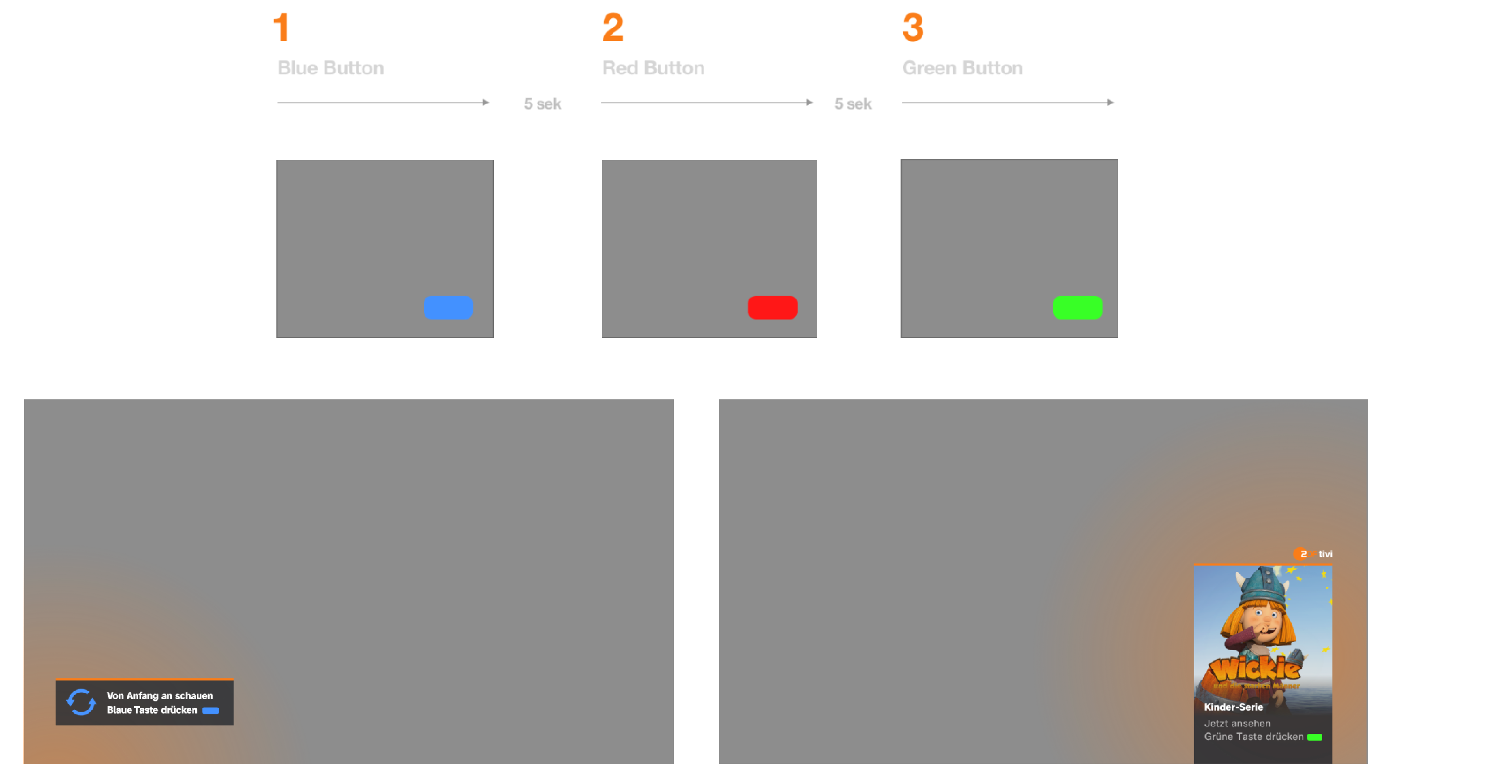
The user should not be overloaded with information when tuning into of the ZDF channels. The solution for this is a pop up choreography. Each pop up appears after a dedicated time one after the other.
1. Most important after tuning into a channel is the current live programm. The user has to decide if he wants to watch live or restart the current show via the blue button.
2. If that content is not interesting, the red button offers access to the different Catch-Up TV Services.
3. If the user does not want to search on his own in the library, lean back editorial content recommendations are provided via the green button.
Restart Feature
New HbbTV app portal
Based on the results from the user survey, the new app portal UX/UI is focused on quick access to the various Catch-Up TV Services of ZDF.
The new structure avoids the mixture of content recommendations and app access.
The new design provides a clear focus and an easy to use UX even on high and low performance devices.
All apps are made for content exploration and recommendations, whilst the portal itself provides easy access.
